Transforming Financial Reporting with Power BI and Excel

In our previous financial reporting insights (see end of article), we covered how to use Power Query to automate the extraction, cleaning, and consolidation of data, and how data models in Power BI or Power Pivot remove the burden of the manual mapping of data. Together, these tools can transform monthly financial reporting - saving time, cutting errors, and creating repeatable processes.
But what happens after the cleaning and modelling are done?
Whilst the underlying technology and workflows of Power BI and Power Pivot in Excel are the same, it’s at this final stage of creating outputs that the two applications offer very distinct but complementary benefits. And even more value gets delivered.
** Read more about the differences between Power Query vs Power BI vs Power Pivot - how each works, when to use them, and their benefits in reporting, analysis and automation. **
Power BI: Turning Raw Data into Dynamic Insights
Let’s start with Power BI. For many accounting and finance teams, it’s becoming the go-to tool for interactive reporting.
Why? Because it’s designed to help users explore their data - visually, interactively, and in real-time.
Once data has been extracted and transformed with Power Query, and mapped in a Power BI data model, you can start designing dashboards and reports that are far more than static snapshots. They’re dynamic, layered, and tailored to both analyst and stakeholder.
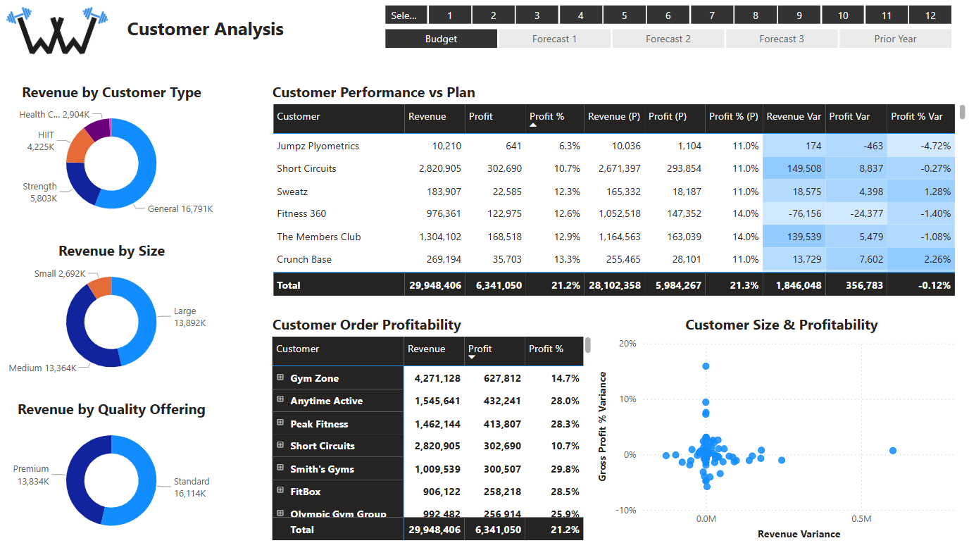
Take a customer analysis report such as the above. With Power BI, you don’t just show revenue or profit by customer - you make that information explorable. Click on a donut chart segment, and everything filters accordingly. Drill into a specific customer, forecast, or time period, and instantly see the context update across every visual.
This kind of interactivity is particularly powerful when presenting to senior stakeholders. Instead of saying “I’ll get back to you on that,” you can answer their questions on the spot. What’s driving the Q3 variance in margin against Forecast 2? Let’s drill in and find out. Which customer types are underperforming year-on-year? Click, click - there’s your answer. Management can start making data-driven financial decisions with Power BI in real-time.
And it’s not just about performance reporting. Power BI is perfect for turning raw financial data into stories - ones that support decisions, spark dialogue, and give business partners the confidence that finance understands the wider strategic picture.
Excel’s Hidden Secret: Power Pivot for Data Big Financials
While Power BI shines in visual exploration of data, many finance professionals still need robust, number-focused reporting, such as financial statements and KPI dashboards.
That’s where Power Pivot in Excel comes in.
Using the same data model principles as Power BI, Power Pivot lets you build detailed, totally customised number-focused reports inside Excel workbooks. You can create outputs that are underpinned by millions of rows of data, yet update in a second when filtered.
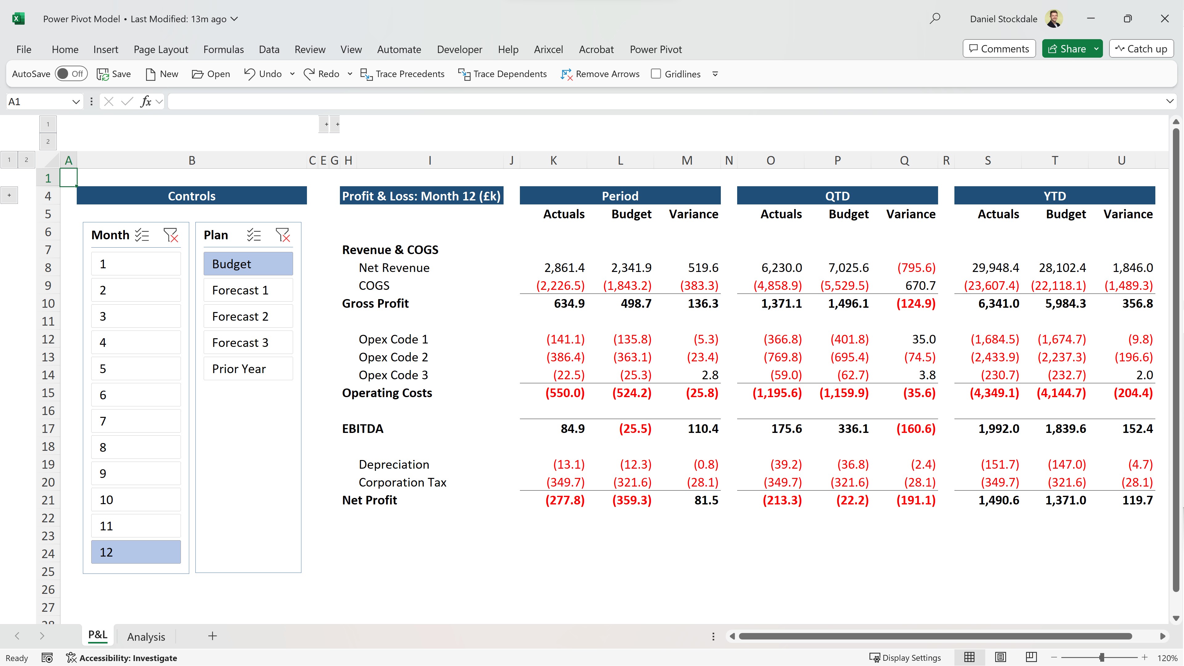
The simple Profit & Loss statement above has been created with special CUBE functions that filter the data model in Power Pivot and aggregate the results. The outcome is that you can select any period and any of the budget, forecast, or prior year comparisons, and then watch your report immediately update. If you were a global organisation, you could add an additional slicer to filter by country – the result would be a global P&L if no filter was selected, or a country or territory P&L if one of more were. The Excel environment, interface, and operation is familiar, but behind the scenes, you’re working with a database-grade model - far more stable and scalable than traditional Excel formulas.
** Raise your data game with our FREE Power BI Tips & Advice eBook **
This means no more giant data summary tables manually mapped together with VLOOKUPs, or long wait times as memory-intensive SUMIFS functions calculate. Instead, Power Pivot uses measures written in DAX – the formula language of Microsoft data models - to power metrics that are accurate, efficient, and refresh in seconds.
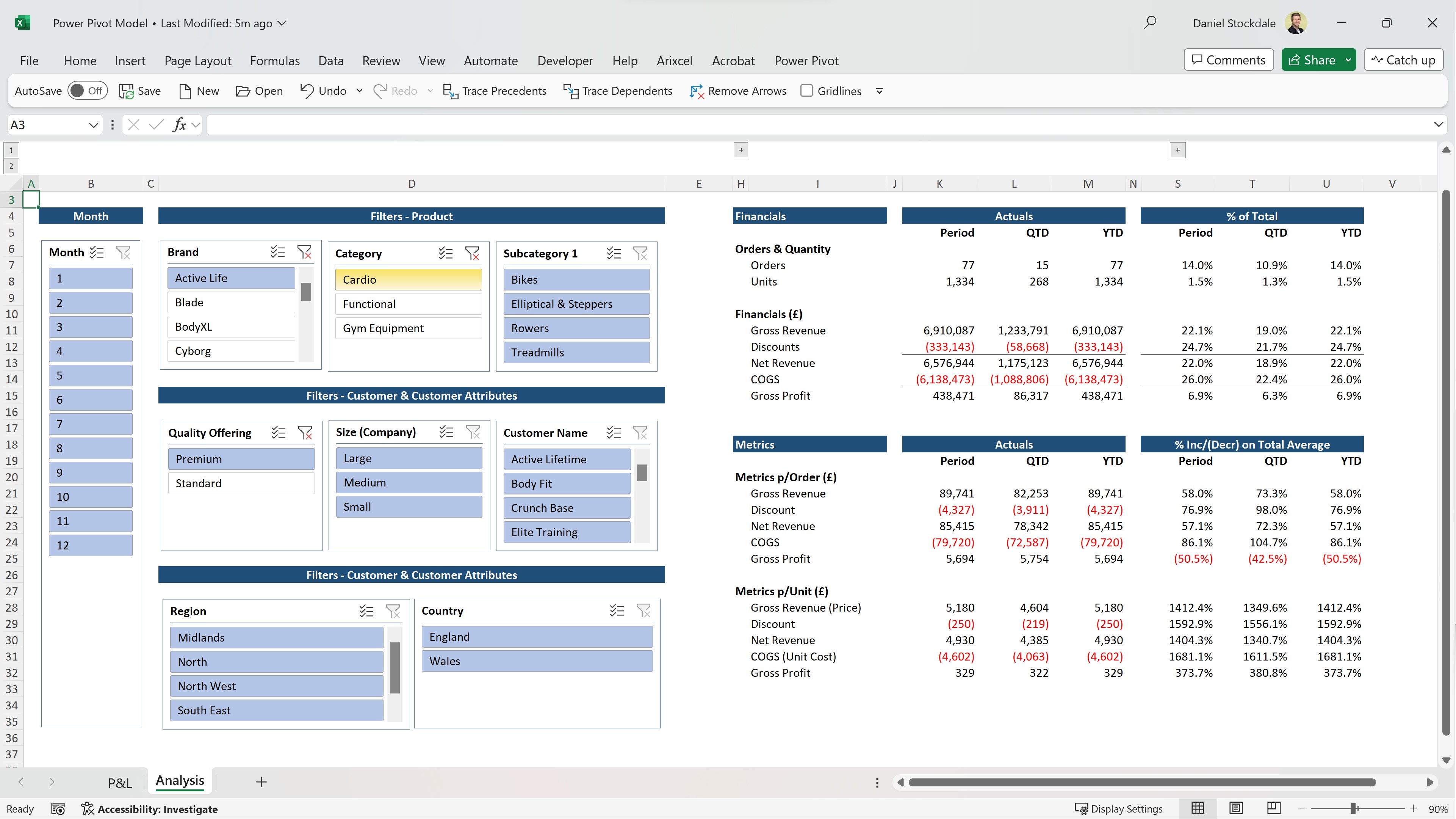
Alternatively, you could create detailed dashboards such as the above that aggregate units, revenue, and COGS from the data model, and then produce simple neighbouring calculations that determine profit and metrics per unit. Any number of slicers could be included to filter the data model in a multitude of ways, and conditional formatting or charts added where required. The look and feel are fully customisable, and you can keep everything within the Excel environment your team already knows.
Slicing, Dicing, and Instant Analysis
Whether you use Power BI or Excel, the end goal is the same: enable faster, more confident analysis.
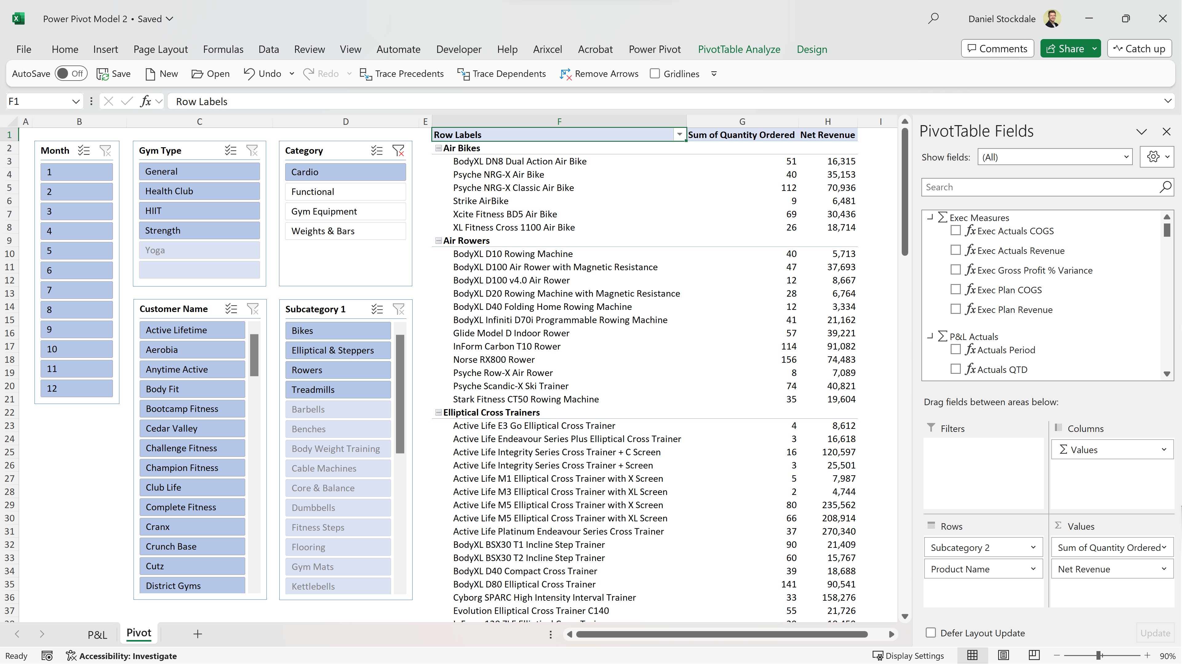
This is where PivotTables come into their own. When connected to a data model, PivotTables let you slice and dice data in seconds - without writing formulas. You can pivot by any field in the model, sort on the fly, and instantly drill down into the detail. This is perfect for quick exploration of big data and finding answers at a granular level.
Compare this to the traditional approach of exporting data into Excel and manually reformatting each view. The Power Pivot alternative gives finance professionals the tools to iterate quickly, explore multiple angles, and respond rapidly to new questions.
The real magic? Once your model is built, you don’t have to rebuild it each month. When the underlying data changes at source - for example, in a database - just hit refresh: Power Query will extract, clean, and load the data into the model, and the PivotTable will instantly update. Wow!
Build Once, Refresh Forever
The workflow across Power Query, Power Pivot, and Power BI isn’t just efficient. It’s transformative.
- You extract and clean your data once using Power Query.
- You map it into data models once using Power Pivot or Power BI.
- You build reports once - financials, dashboards, or interactive visuals.
After that, everything updates with a click.
This “build once, refresh forever” approach removes one of the biggest sources of waste in finance reporting: repetition. It frees your time to focus on value-added work like analysis, scenario planning, and strategic insight.
And as you gain confidence with these tools, you’ll find more and more opportunities to move away from reactive reporting - and towards data storytelling.
Want to Learn the Whole Workflow?
If you’ve followed all three reporting insights, you now have a clear roadmap:
- Clean and transform your data with Power Query.
- Model and map it using Power BI or Power Pivot.
- Turn that model into insightful, updateable reporting.
To go further, our Power Automation Bundle offering is your next step to automate monthly reporting with Microsoft tools.
It includes the following two courses:
Together, they cover the entire reporting lifecycle - from data connection to dashboard – and the above images are just some of the outputs created in the courses.
Whether you’re looking to improve finance workflows with Excel automation, upskill in financial reporting with Power BI, or learn data visualisation for finance professionals, this bundle delivers. It’s one of the most practical ways to deliver real value, from more of your organisation’s data, and in less time.
Related Insights
If you missed the earlier guides in this series:
👉 Automate Data Cleaning in Financial Reporting with Power Query
👉 Automate Mapping in Financial Reporting with Data Models
Each builds on the last. Read them in sequence for a full, practical walkthrough of automating your reporting stack.