Automate Mapping in Financial Reporting with Data Models

In financial reporting, how your data is structured often determines how quickly and confidently you can analyse and report on it. Whether you're mapping your monthly accounts or rolling up quarterly performance, your data structure underpins everything. That’s why learning to build robust data models in Power BI – or Power Pivot in Excel – can be a game-changer.
If you’ve already automated data cleaning using Power Query (see Post 1), the next step is structuring that data effectively. This is where data models come in: they remove manual wrangling (a data term for merging multiple data sources into one, ready for analysis), reduce the risk of formula errors, and open the door to faster, more flexible reporting.
Why Data Models Matter in Financial Reporting
In many finance teams, it's still common to handle mapping in Excel worksheets. You receive a trial balance or transaction export. Then you:
- Paste in mapping tables from other sheets
- Create lookup formulas using INDEX MATCH / XLOOKUP / VLOOKUP
- Stitch everything together in one massive table
It works – but it’s fragile. As the volume of data grows, or a new month of data is added, the formulas stretch, errors or the fear of errors creep in, and performance suffers.
Power BI and Power Pivot change this. Instead of stitching everything together into one big Frankenstein’s monster, you load each dataset into its own table, then define relationships between them – for example, connecting transactions to your chart of accounts via account code, or linking cost centres to departments via a shared key. In doing so, you create a data model.
This approach means you don’t need to update formulas each time new data is added, your files don’t balloon in size, and your calculations don’t slow to a crawl as they're designed to work with big data. Instead, Power BI references the relationships directly. New data is instantly included in the model. The structure handles the complexity, so you don’t have to.
** Read more about the differences between Power Query vs Power BI vs Power Pivot - how each works, when to use them, and their benefits in reporting, analysis and automation. **
What Is a Data Model?
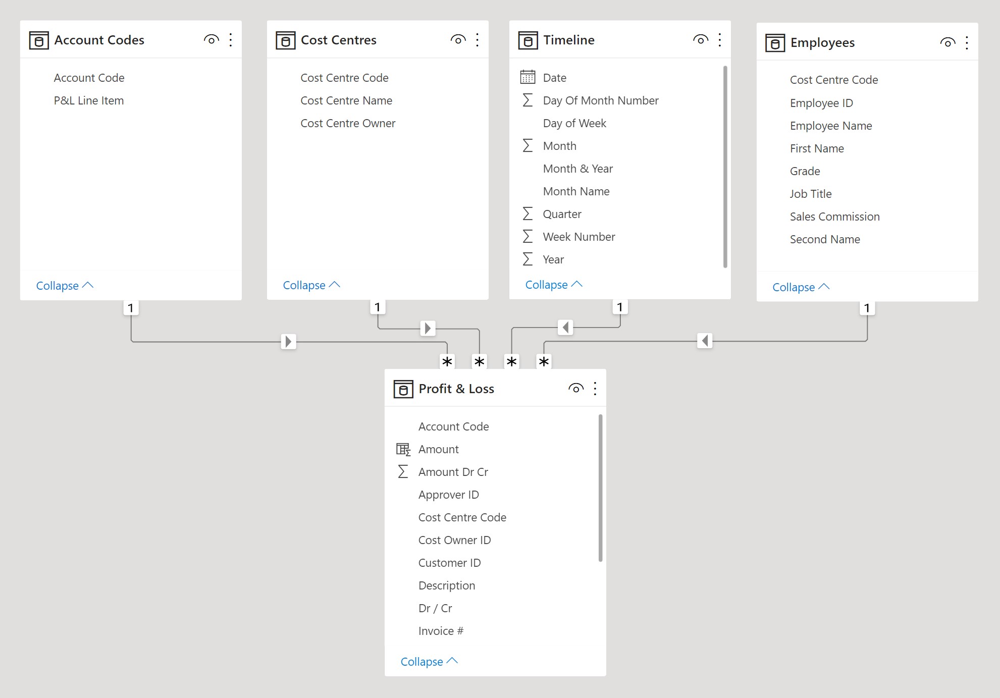
At its core, a data model is a collection of related tables. Each table serves a specific role: transactions, account mappings, employee details, timelines. Rather than lumping all data into a single sheet, each table holds only what it needs.
The magic happens in the relationships. These are links between fields (or columns) in different tables – like Account Code in the Account Codes and Profit & Loss tables, below. Once defined, these relationships enable calculations to flow across tables without the need for the lookups mentioned earlier.
Say you want to total spending by P&L Line Item. With the above relationship in place, and the Account Codes table providing a P&L Line Item name with each Account Code, the data model is able to trace that path and aggregate the Amount column in the Profit & Loss table by P&L Line Item. It does this using a piece of DAX code known as a 'measure' and through a process called 'filtering'.
This approach not only saves time, it also ensures consistency. You define the logic once and reuse it throughout your reports. As new data is added, no maintenance or updating is required.
From Manual Mapping to Model-Based Reporting
Let’s recap the previous two sections in a real-world example. You’re preparing month-end management accounts. You have a trial balance exported from your accounting system, and a separate file that maps account codes to reporting lines. You also want to include cost centre details for departmental analysis.
In Excel, the typical route would be to load everything into one workbook, then apply lookup formulas to stitch together account names, reporting categories, and cost centre hierarchies. It’s fiddly. You probably double-check every formula. And when data changes next month, you have to repeat the whole process. You live in constant fear that you might have missed something or made a mistake.
Now let’s take the Power BI approach.
You load each dataset as a separate table: one for the trial balance, one for account mappings, one for cost centres. You go into Model View and create relationships between these tables – for example, linking Account Code from the trial balance to the account mapping table, and linking Cost Centre to the cost centre table.
Now when you build a report, you can write a measure like ‘Total Expenses’. Power BI will leverage the data model relationships to return expense figures, broken down by category, department, or period, depending on how you filter.
This model-driven approach dramatically reduces the manual spade work in your reporting cycle. And if you're using Power Pivot in Excel, you'll have a similar workflow – just load data in, build relationships in Diagram View, and use PivotTables or CUBE functions to create reports in your worksheets.
** Start improving the efficiency of your Power BI financial reporting with our FREE Power BI Tips & Advice eBook **
Performance and Risk Reduction
Finally, one of the most overlooked benefits of a good data model is speed. As your data grows, Excel workbooks filled with lookup formulas slow down. Data models, by contrast, are designed to handle scale. Power BI can process huge volumes of data quickly, using in-memory storage and optimised calculations.
This means less waiting around watching the loading bar fill to 100%, and more time analysing your reports.
And then there's the risk element. When you remove manual formulas and replace them with structured relationships, you reduce the chance of human error. Your mappings become inherently robust and not something you have to recheck each month.
In audit or review scenarios, this becomes invaluable. Your process is traceable, your structure is transparent, and your reports are trusted.
So What’s Next?
Once you’ve cleaned your data with Power Query and built a model using relationships, you’re ready for the next stage – building dynamic, interactive reports. In our next post (see end of article), we’ll explore options for turning this data model into visuals, dashboards, and financial statements.
Take It Further
Want to deepen your skills and build monthly financial reporting workflows in Power BI from the ground up? Our Power BI Monthly Financial Reporting course covers how to clean, model, and visualise financial data – using comprehensive datasets from our fictional gym equipment wholesaler, Workout Warehouse.
Whether you’re reporting on operating expenditure by cost centre, analysing the performance of the sales team, or preparing board packs – this course gives you the structure and skills to do it faster, better, and with fewer errors.
So if you're looking to improve workflow efficiency with Power BI, and away from data cleaning and mapping in Excel, check out our online Power BI courses for accountants.
Related Insights
If you found this useful, check out our other insights:
👉 Automate Data Cleaning in Financial Reporting with Power Query