The 5 Stages to Creating Power BI Financial Reporting

If you’re an accounting or finance professional looking to save time and deliver more insightful, reliable monthly reporting, Power BI can transform the way you work. This article walks you through the five stages to creating automated, dynamic financial reporting in Power BI - so you can focus less on manual tasks and more on adding value.
1. Automate the extraction and cleaning of financial data with Power Query
What is Power Query?
Power Query is an ETL (Extract, Transform, Load) tool available in both Power BI and Excel. It allows finance professionals to connect to a wide range of data sources and bring all the data together in a standardised interface - the Power Query Editor (PQE) - to be worked on. It is capable of working with millions of rows of data, can automate the cleaning of data, and enables organisations to leverage more of their data in disparate sources.
You can access Power Query in Power BI via Home > Transform Data, which opens the PQE workspace - shown in Figure 1.
Queries are shown in the left-hand pane, a snapshot of the selected query’s data is shown in the centre, transformation options to clean the data are shown in the Ribbon at the top, and each transformation applied to the data is recorded in the pane on the right.
Connect to financial and non-financial data from many sources
Finance teams typically work with data from trial balances, charts of accounts, actuals, and forecasts. With Power Query, you can connect directly to these sources - often stored in Excel files, databases, cloud-based platforms, or entire folders containing monthly exports. There are over 200 data source types that can be connected to.
To connect to data from PQE, go to Home > New Source > select the data source type > locate your file or database > Open > select the relevant data > OK.
Importantly, Power Query can also pull in non-financial data - from tools like Google Analytics or CRM platforms - enabling finance to go beyond traditional systems and deliver broader insights to the business. This adds a huge element of freedom and creativity to the financial reporting and analysis process.
Clean the data by recording transformations
The typical monthly financial reporting process often involves considerable time spent cleaning and preparing data taken from systems or received from stakeholders around the organisation. This might include merging columns, fixing formats, or filling-in missing data. Power Query automates this process. Each transformation you apply in PQE - whether replacing values or removing columns - is recorded in the Applied Steps pane and automatically re-run every time the data is refreshed.
This ensures consistency, saves time, and significantly reduces the risk of error, all without altering the original data at source.
Load the cleaned data into Power BI
Once the data is transformed, selecting Home > Close & Apply loads it into Power BI as tables - ready for modelling, calculations, and visualisation. These can be viewed in Power BI’s Table View
** Start transforming your Power BI skills with our FREE Power BI Tips & Advice eBook **
Updating for a new month of data
For monthly financial reporting, updating your data is simple. You might refresh a database query, point Power Query to a new Excel file, or drop new data into a connected folder. Selecting Refresh in Power BI repeats the above Extract, Transform, and Load stages, streamlining your workflow and speeding up month-end reporting.
Improve workflow efficiency with Power BI and Power Query
This structured, automated approach is the first stage of our Power BI Monthly Financial Reporting course - designed to help finance professionals reduce their manual workload and build robust reporting processes that scale with confidence.
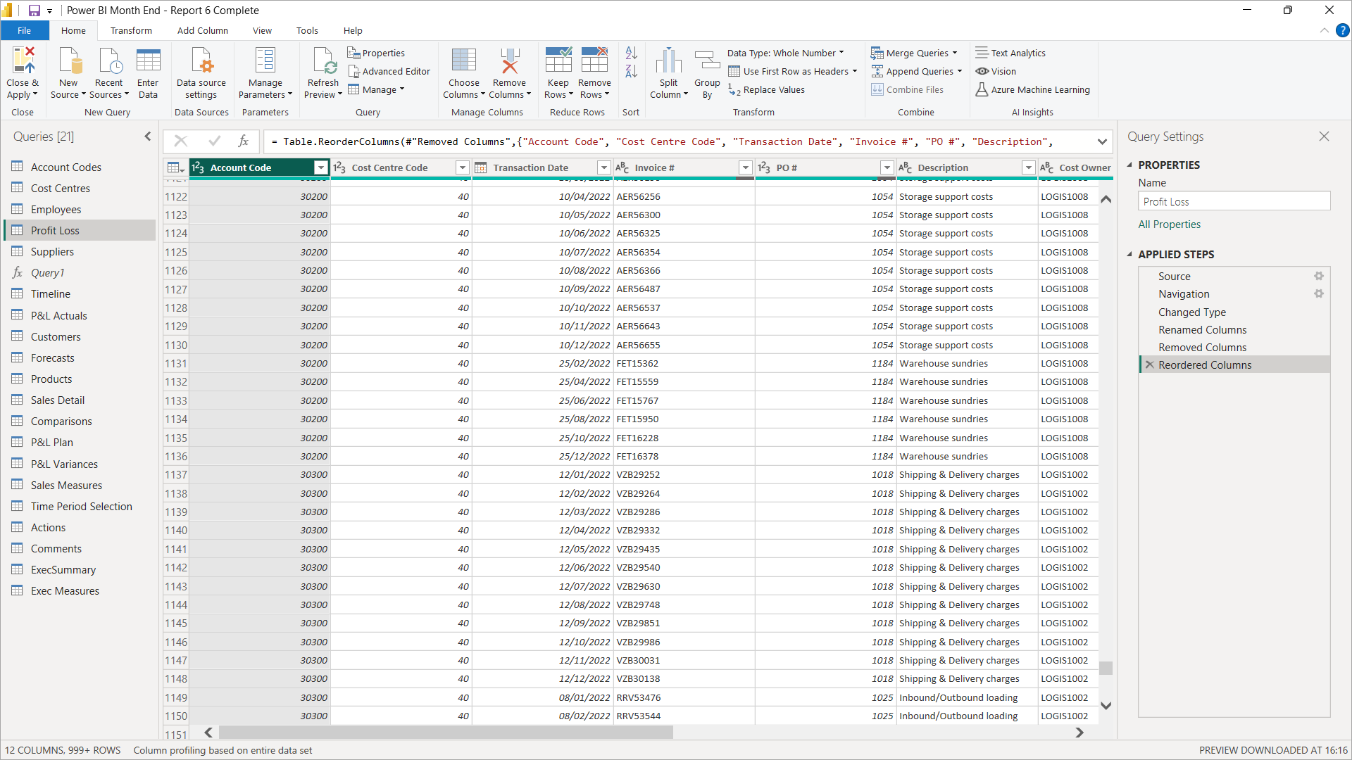
Figure 1: Power Query Editor interface showing Profit & Loss data and recorded transformations in the Applied Steps pane
2. Map financial data in a data model
What is a data model?
At the heart of Power BI reporting lies the data model. Instead of working with a single giant table of data, you build a network of related tables, linked by defined relationships – a data model. For finance professionals, this means mapping your transactional-level data - like actuals or forecasts - against descriptive attributes such as your chart of accounts, cost centres, or business units.
Data models consist of two types of table: Fact tables hold detailed transactional records and may extend to millions of row of data, and Lookup tables containing attributes that add context and structure, helping you filter, group, and slice your data meaningfully.
Figure 2 shows a data model in Power BI’s Model View, consisting of five lookup tables located at the top, three fact tables at the bottom, and relationship lines linking them.
Creating the data model
Building these relationships is straightforward in Model View. By clicking and dragging from a column in a lookup table to a related column in a fact table, you create the connections that Power BI uses to map and filter large volumes of data accurately and efficiently.
** Get practical insights and best practices with our FREE Power BI Tips & Advice eBook **
Advantages of data models versus manually mapping data in Excel
Compared to the manual approach many teams still use in Excel - copying, pasting, and stitching data together with complex formulas - data models are cleaner and far more robust. Instead of worrying about broken formulas or missing rows, your model automatically absorbs new data every month, saving hours of maintenance and minimising human error. And because the model is optimised for large datasets, your reports remain fast and responsive.
Tip: If you’re just starting out, keep things simple
Begin with two or three tables in your data model and work through the Power BI stages to create your first report. Ensure that it delivers results as expected before expanding things further. Building your data model piece by piece helps you stay confident while delivering useful insights right away.
The data model in our Power BI Monthly Financial Reporting course is built up iteratively so that the learner isn’t overwhelmed and understands each stage, as well as the impact it has on the reports. The data model shown in Figure 2 is taken from midway through the course.
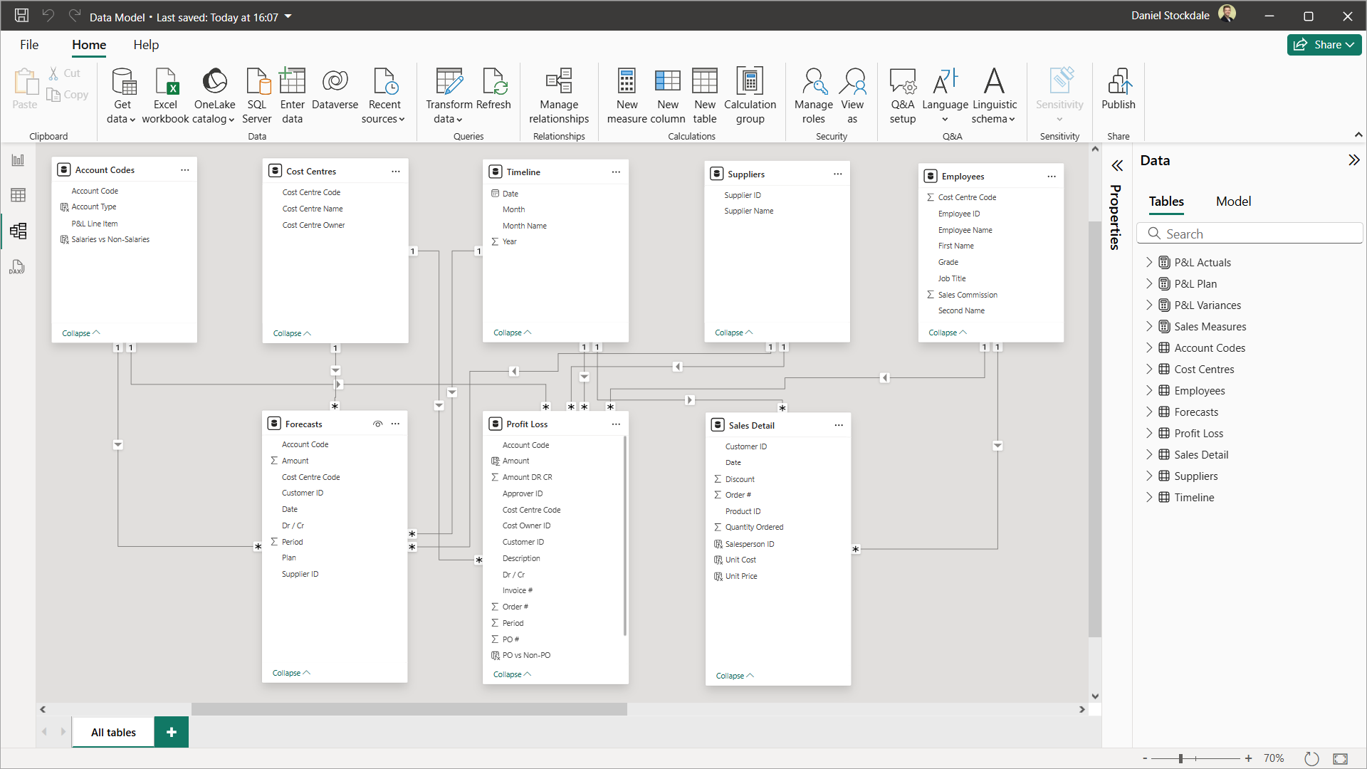
Figure 2: Data model consisting of five lookup tables and three fact tables connected via relationships
3. Create financial metrics with DAX
What is DAX?
Data Analysis Expressions (DAX) is the formula language of data models in Power BI (and Power Pivot in Excel). It’s designed for speed, scale, and size, enabling you to execute powerful calculations on the ever-growing big data within your data model with little to no lag in performance.
DAX is used to create both calculated columns - useful for grouping data - and measures, which perform dynamic calculations used directly in your report’s visualisations.
Grouping financial data by type using calculated columns
Calculated columns can help you add business logic to your data model. For example, you might group account codes into cost types, or link cost centres to business units. These new attributes make your reports more insightful and easier to filter.
Figure 3 shows an Account Codes table with a new calculated column of data added to it called Account Type. The DAX in the formula bar applies the account type Revenue, COGS, Depreciation or Tax if the corresponding account code is found in the Account Code column, otherwise it applies the account type Opex. This new Account Type column could then be used in the creation of an Opex Costs report by filtering just for Opex account codes.
** Level up your DAX skills with our FREE Power BI Tips & Advice eBook **
Creating financial measures for actuals, forecasts, and variances
Measures are the core of financial storytelling in Power BI. They allow you to calculate figures like revenue, gross profit, margin percentages, or any variety of business KPIs. Crucially, you can create these separately for actuals and forecast data, and then build variance calculations that compare the two - putting performance into context in your reporting.
Adopting good practices to keep financial reporting organised, efficient, and understandable
Clear naming conventions, measure branching, and well-structured measure tables make a huge difference. Keeping your DAX calculations organised helps you maintain accuracy, avoid duplicate measures, and makes collaboration with colleagues far easier in the long run.
Our Power BI Monthly Financial Reporting course includes extensive DAX calculations, techniques, and best practices tailored specifically to accounting and finance professionals, empowering them to make data-driven financial decisions with Power BI and produce reports that are relevant to their requirements and stakeholders.
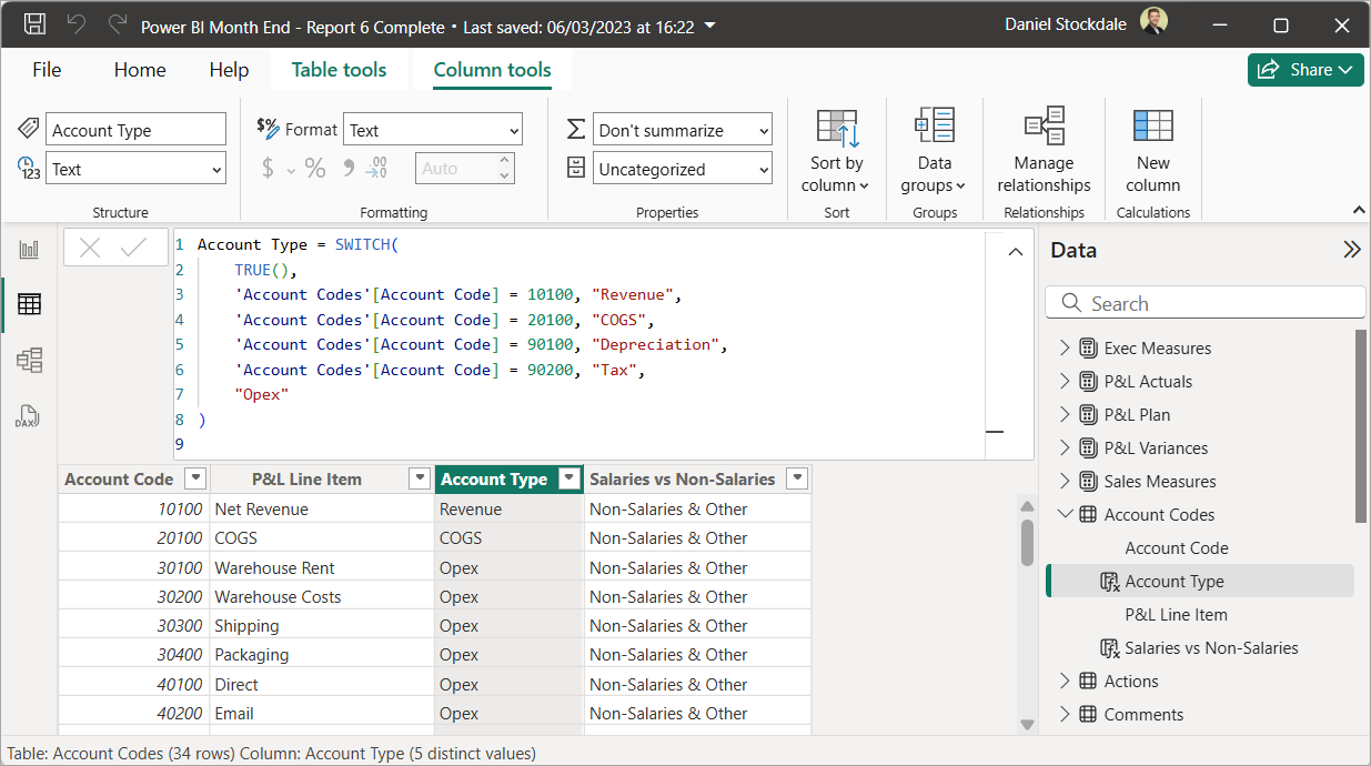
Figure 3: DAX code has created a calculated column, Account Type, to group Account Codes
4. Visualise financial metrics in reports
What is Report View?
Once your data model and measures are ready, it’s time to bring them to life in Report View. Here, you can select from a range of visualisations in the Vizualizations pane, place them in your report’s page, and then drag and drop columns and measures to populate them.
Figure 4 includes donut charts, a table, a matrix, and a scatter chart.
Design financial context into reports with comparisons to forecasts
A strong Power BI report for financial reporting doesn’t stop at actuals. Comparisons to forecasts, budgets, or prior years add essential context. Slicers, conditional formatting, and variances help your audience understand performance at a glance.
Figure 4 includes a tiled slicer at the top allowing the user to toggle between Budget, Forecast 1-3, and Prior Year. This filters the comparison figures in the report - such as the three middle columns of the table - accordingly. Variance measures have been created and dropped into the final three columns of the table, and conditionally formatted in shades of blue, as well as into the scatter chart.
Select visualisations that complement the data and each other
Choosing the right visuals is vital. Each should complement the data and one another, to create a clear, effective, and concise report. For inspiration on how to present data insights using Power BI, see our separate article on 5 Power BI Visualisations for Financial Reporting - a handy guide for selecting visuals that work well together.
Leverage the dynamic and interactive functionality when presenting the numbers
A key strength of Power BI is interactivity. Clicking on a visual automatically filters other visuals on the page, so you can start with the big picture before drilling down into the detail in real time. This feature is especially powerful when presenting to stakeholders, enabling you to craft a narrative with dynamic visualisations.
Figure 4 provides lots of useful information on performance and profitability across all customers. Any or all of the donut charts could then be clicked to filter the table, matrix, and scatter chart to focus in on particular types of customer.
** Start building best practices into your financial reporting with our FREE Power BI Tips & Advice eBook **
Answer stakeholder questions in real-time to reduce follow-up work
Finally, unlike static spreadsheets or printouts, an interactive report means you can drill down instantly. When stakeholders ask for more detail or query the information, there’s no need for a follow-up email or extra analysis later - you can answer on the spot, saving time and boosting confidence in your numbers.
This is another overlooked advantage of Power BI in financial reporting and a big time-saver for finance professionals.
Data visualisation for finance professionals
If you’re considering using Power BI for big data visualisations, our Power BI Monthly Financial Reporting course looks at how to develop six reports relevant to financial and commercial reporting, layering in relevant techniques as we go.
Each section of the course is framed in “month-end context” that considers how learning Power BI can save time, improve workflows, and engage stakeholders more effectively than traditional monthly financial reporting.

Figure 4: Customer Analysis report with various visualisations, plus slicers for toggling reporting periods and comparisons
5. Publish to Power BI Service and distribute to stakeholders
What is Power BI Service?
The final step is sharing your insights. Power BI Service is Microsoft’s secure, cloud-based platform - available by subscription - where you can publish, manage, and distribute your reports to the wider organisation. It ensures everyone sees the latest version of your financial reports, maintains version control, and enhances data security — including the ability to restrict user access to sensitive financial data through row-level security.
Publishing your financial reporting to Power BI Service
Publishing is simple: from Power BI Desktop, go to Home > Publish and select the workspace for it to live in.
Distributing your financial reporting to stakeholders
Once your report is in Power BI Service, you can distribute it to stakeholders across your organisation in a similar way to sharing work in One Drive – select the report > Share > enter email addresses, copy links, or share via Teams.
Additionally, access permissions can be applied by user to the Workspace containing the report, allowing them Admin, Member, Contributor, or Viewer rights.
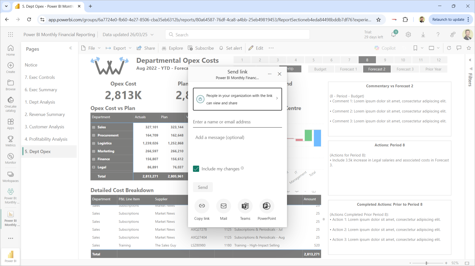
Figure 5: Department Opex Costs report, published to Power BI Service and open in a web browser, in the process of being distributed
Conclusion
Mastering each of these stages transforms your financial reporting from a manual, time-consuming task into a scalable, insight-driven and efficient process. From automating data extraction and cleaning to modelling, calculating, and sharing insights securely, Power BI helps finance professionals save time, reduce risk, and deliver more value in the monthly financial reporting process.
Online Power BI training courses for accountants
The content of this insights article, including images, is all taken from our course Power BI Monthly Financial Reporting – a comprehensive Power BI course tailored specifically to accounting and finance professionals. If you’re looking to produce your financial reporting with Power BI, you can learn more at:
- Visit our self-study video course page.
- For teams looking. for live training, get in contact.
- For individuals looking for live training, we deliver the course through the ICAEW - visit the ICAEW live course page.