5 Power BI Visualisations for Financial Reporting

There are many advantages to producing our quarterly or monthly financial reporting in Power BI: it allows us to leverage more of our organisation’s data, including big data, all in one place; with Power BI’s inbuilt Power Query tool, we can automate the extraction, cleanup, and transformation of data; we can map data more robustly in data models; and the underlying data in the reports we distribute via the cloud is much more secure than when emailed.
But what Power BI really excels at is communicating information in a more understandable format. Not only can we convey information in colours, shapes, and sizes, rather than just numbers, we can also interact with the report, allowing it to dynamically update and help us tell a story as we present.
Here, we consider five of the best Power BI visualisations for financial reporting, including an example of how to present data insights with Power BI, and how and why they are so effective when presenting to our stakeholders, whether it be a Finance Director or Head of Sales.
Matrix
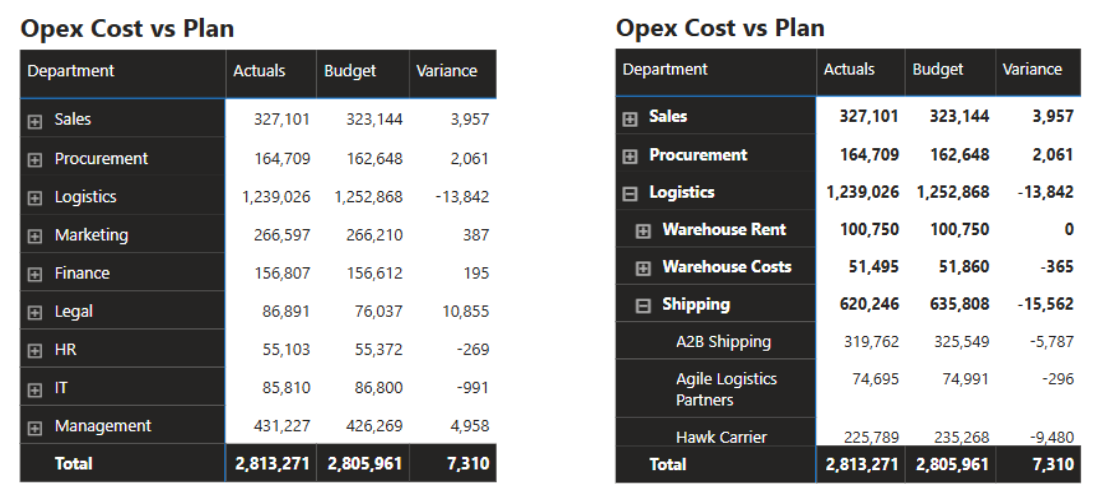
What this visualisation lacks in colours, shapes and sizes, it makes up for in interactivity. A matrix is effectively a grouped table of data that we can drill down on to provide more detail.
Imagine we are reviewing the below operating expenses with our Financial Controller. We can initially present Actual versus Budget spend at a departmental level. They may query the 13.8k underspend in Logistics and ask for more detail. Rather than go away and look into it, we can drill down on Logistics there and then to reveal a breakdown of the cost lines making up the total, such as: Warehouse Rent, Warehouse Costs, and Shipping. We can see Shipping is driving much of the underspend, so we can again drill down on this to provide a breakdown by Supplier and so on.
So, with a Matrix, we can start presenting at a high level and then provide more detail if requested by our audience – making this an especially effective option when presenting to senior management.
** Start transforming your Power BI skills with our FREE Power BI Tips & Advice eBook **
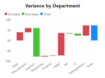
Waterfall
A good tip in Power BI is to try and pair visualisations that complement one another. We noted above that the Matrix is big on interactivity, but low on communicable colours, shapes, and sizes. We could use a Waterfall to visualise the final column of the Matrix, showing the departmental total variances to Budget.
As you can see, we can very effectively convey the two largest variances from the Matrix - the Logistics underspend and the Legal overspend - in a Waterfall, as well as generally presenting a bridge explaining our Budgeted to Actual spend.
Finally, if you’ve tried creating one of these in Excel, you’ll know how tedious and unintuitive the process is. Not with Power BI…it’s drag-and-drop in seconds!
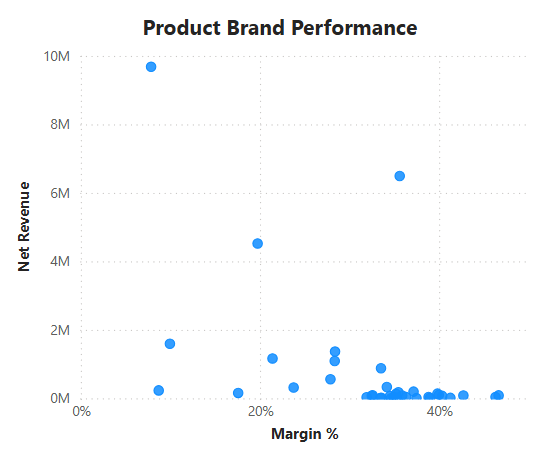
Scatter Chart
Financial reporting doesn’t have to all be about explaining variances against Budget or the latest Forecast. Amongst all the data organisations now collect lies the opportunity to add real value by generating commercial insights relevant to our audience.
Consider this…we could have millions of rows of data on thousands of products sold across hundreds of brands. With this Scatter Chart, we can distil all this down into the most impactful insights…how much do we sell, and which make us good margins.
This is such an effective visualisation because, among the 40 brands that are present in the data and shown in the Scatter Chart, we can immediately see three that really matter: At the top left, we have our biggest revenue generator, but its margins are very low (~9.8m revenue, ~8% margin). Instead, the majority of our margin comes from the outlier below on the right (6.4m, 35%). And below and between these two, we have a brand that may have potential to be developed further (4.5m, ~20%). Present this to the Sales team, and you might kick-start a change in their strategy to focus more on selling the second and third. It's a great example of how we can make data-driven financial decisions with Power BI.
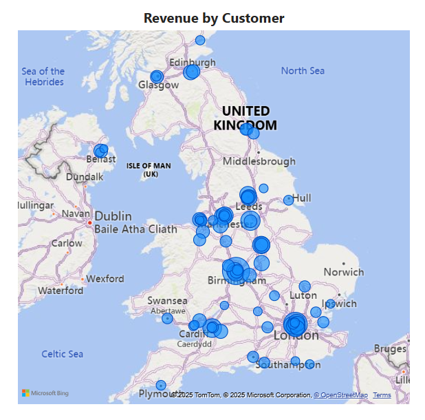
Map
The Map visualisation in Power BI will appeal to some sectors more than others. For instance, in retail, plotting returns by store could highlight geographical trends that could then be taken up with regional managers to resolve customer satisfaction issues. This is pretty useful and is another novel way of presenting information to engage your audience.
But if it’s not relevant to your industry, it does at least show you the awesome functionality of Power BI. Simply dropping a revenue measure and post/zip code field into the visualisation instantly produces the map below. And if that’s not impressive enough, you can scroll your mouse to zoom in, literally down to street level.
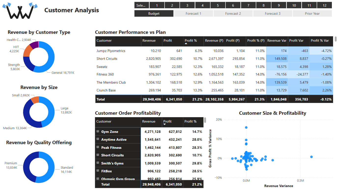
Donut
To end with…the Donut. We have three pieces of advice here.
Firstly, use a Donut over a Pie Chart – they do the same thing, but the latter is a slightly more tired and traditional visual.
Secondly, limit the number of categories you present within it to ideally a maximum of 6-7. If you have too many categories, the individual slices become too small, we can’t tell what they represent, and meaning gets lost. So, in this case, less is more. In the example below, all the information is clear, useful, and certainly not overwhelming.
Finally, think of its purpose as, not only to give you information, but also as a report filter! The Customer Analysis report below is one of the six reports we create in our Power BI Monthly Financial Reporting course and features a mix of visualisations. Whilst the Donuts on the left provide useful high-level revenue analysis, if we were to hold Ctrl and click each of them, we could filter the other visualisations to show Strength-focused gyms, of a Medium size, and Premium offering.

Online Power BI Courses for Accountants
The below Customer Analysis report is taken from our Power BI Monthly Financial Reporting course. If you're looking to produce financial reporting with Power BI, master data visualisation for finance professionals, or improve finance workflows with automation, learn more about our online Power BI courses for accountants at the above link. We also have courses that cover how to automate financial reporting with Power BI, Power Query, Power Pivot, and Python in Excel.